Mobile
UX Designer
Figma, Miro
UX Research, User Flows, Prototyping, Testing
In this student project, we were tasked with developing a mobile application to be complemented by a physical artifact utilizing information technology, to make a visit to Öland more meaningful.
Our product, LitterAlly, aims to cultivate anti-littering habits in various settings, from daily routines to local outings and vacations. By providing a service that supports environmental conservation, addresses littering concerns, and resonates with nature enthusiasts, we aim to pioneer new trends toward a greener planet.
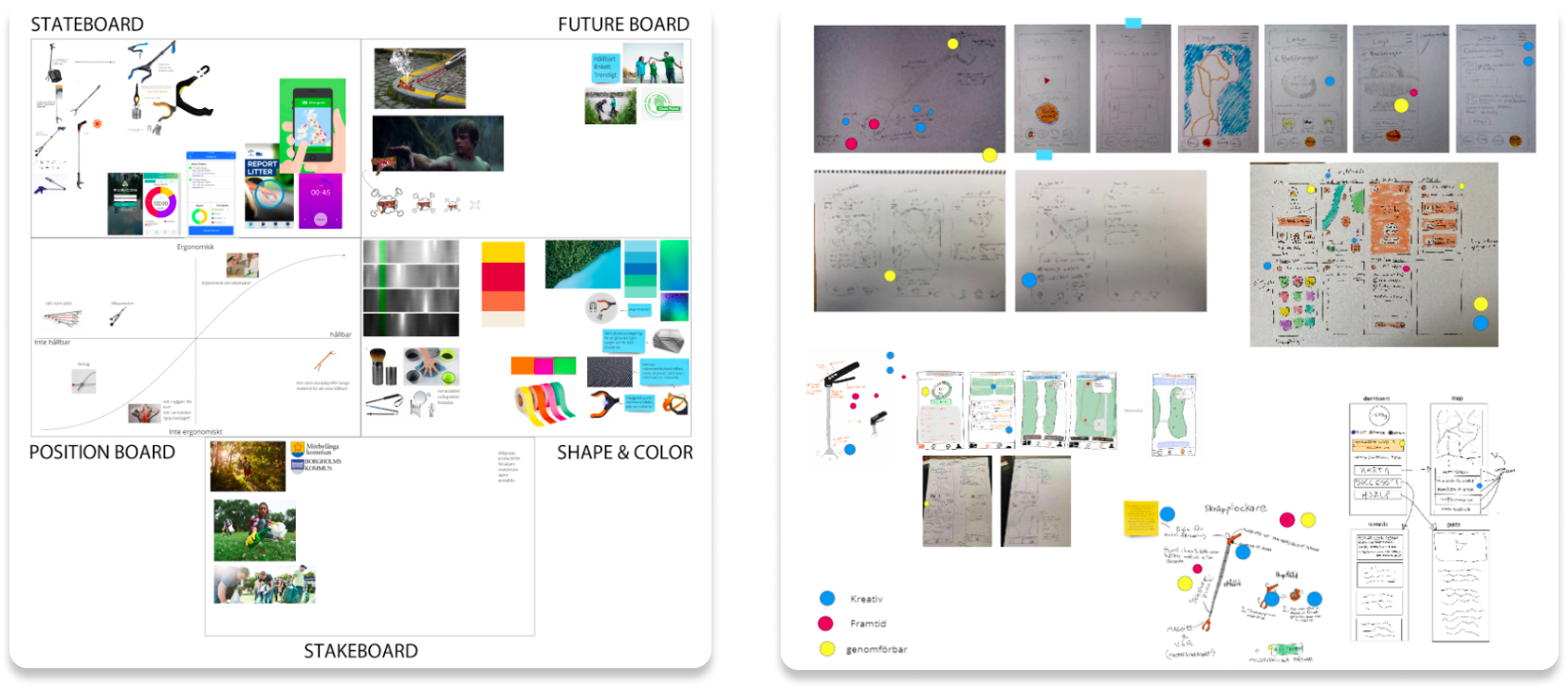
The concept was developed through a six-person user workshop, and defined through the Identity Tool Kit- and Dot Voting methods. The LitterAlly concept encourages litter collection through gamification, offering rewards for participation.

The user workshop served as a valuable platform for collaborative brainstorming, fostering creativity and innovation. It provided us with an opportunity to generate and refine ideas in a dynamic and interactive environment, ultimately leading us to a more effective and impactful solution.
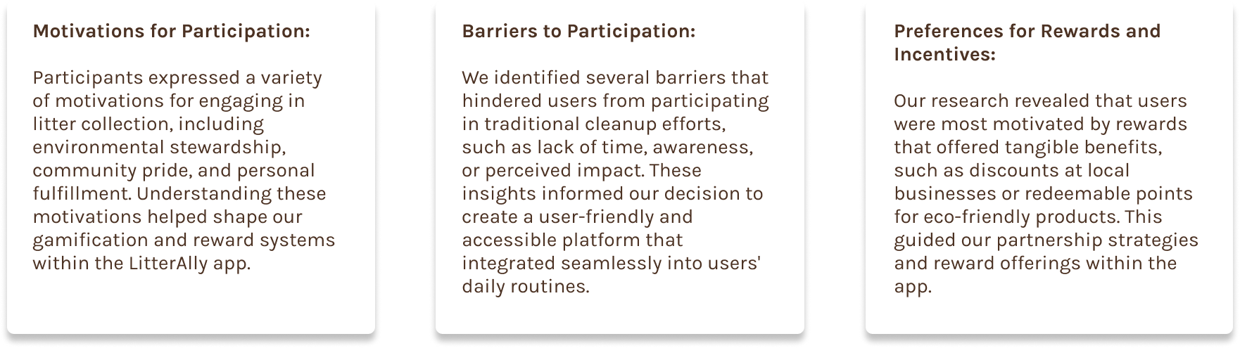
During the user workshop and subsequent research phases, we gained valuable insights into the behaviors and preferences of our target audience. Through structured discussions and activities, participants expressed a strong desire for a mobile application that not only addressed environmental concerns but also provided tangible incentives for participation. Key findings from our user research included:
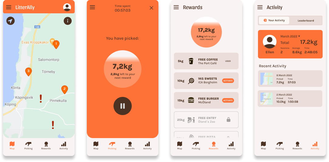
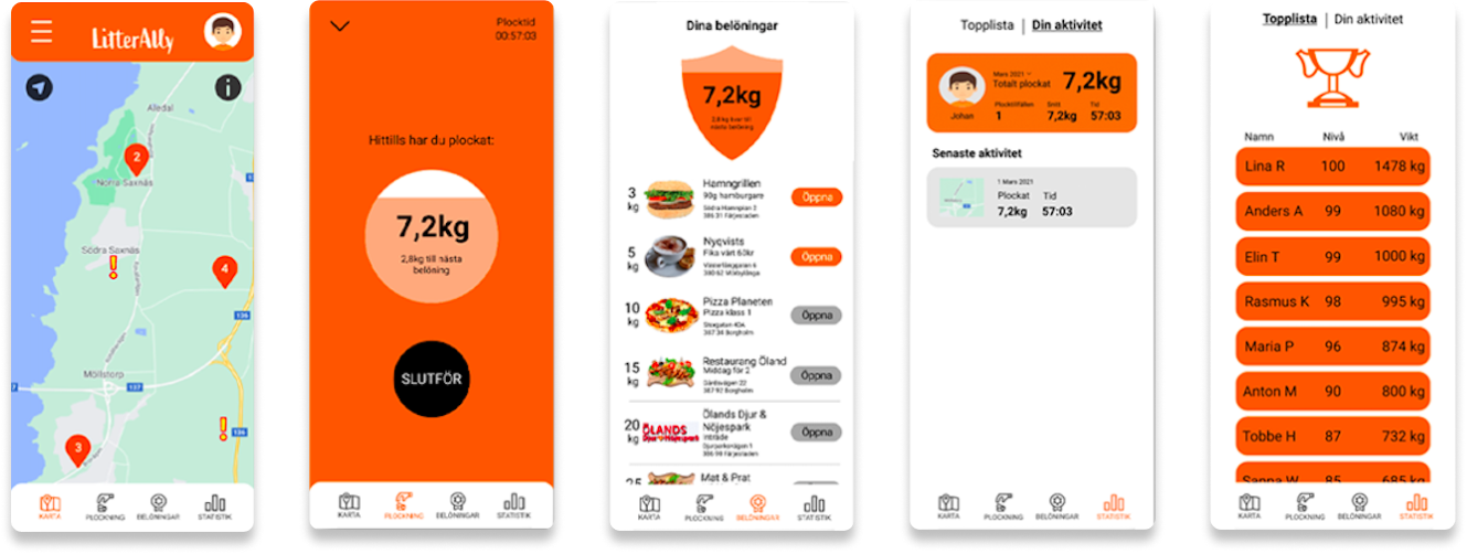
The concept we came up with for LitterAlly is an app that gives users the opportunity to collect litter in exchange for rewards from local businesses. To complement the LitterAlly mobile app, we would create a physical litter picking tool with an ergonomic design and built in scale to help track the user's picking.
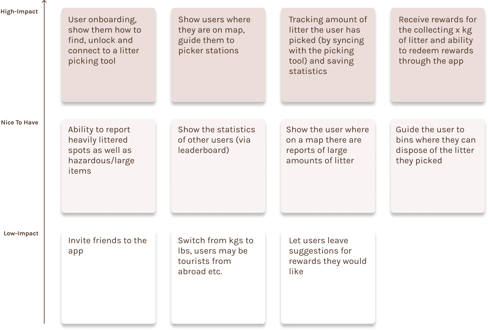
After the initial stages of concept developement had provided us with a sense of direction, the group compiled a list of needs and requirements based on the impact that we wanted to address in this project.
With a list of needs defined, we transitioned to individual sketching. Creativity flourished as we brainstormed independently, this meant we could ideate freely, learn from each other and incorporate the best parts of each group member's ideas when refining the designs.
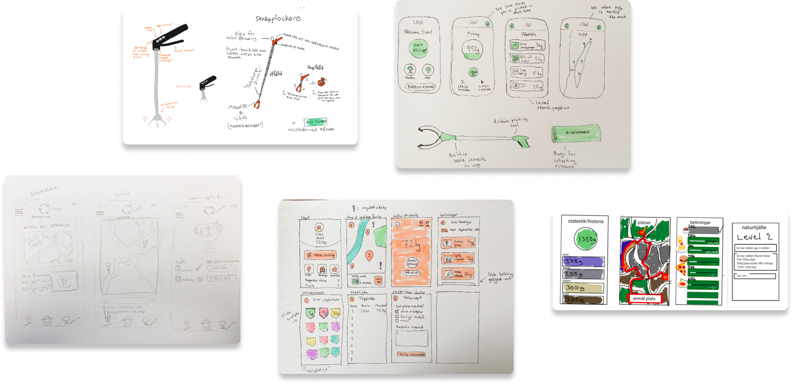
During this phase, we delved deeper into user understanding by crafting personas based on our initial user research to represent our target audience's needs and behaviours as accurately as possible.
Simultaneously, storyboards helped visualize user interactions, uncovering pain points and moments of delight. This holistic approach fostered empathy and guided our design decisions towards user-centric solutions.
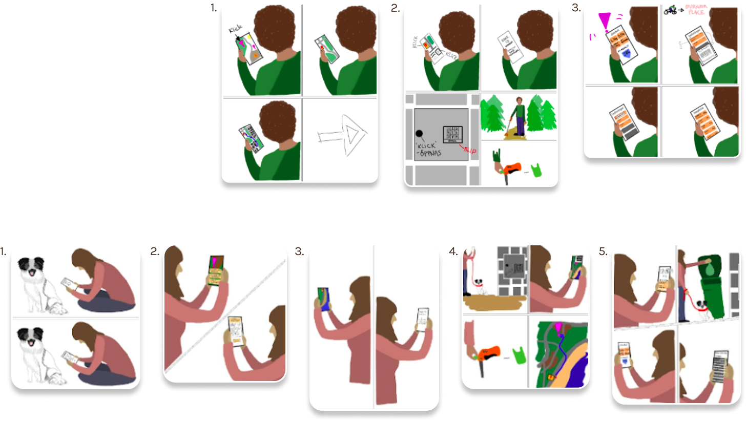
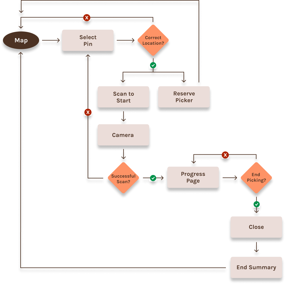
User flows are important tools for mapping out the journey of our personas through the app. By visualizing the steps involved in critical tasks such as the start to end of a picking session as seen below, we identified bottlenecks and opportunities for enhancement. This systematic approach helped us work towards seamless navigation solutions by always prioritizing user experience and efficiency.
Once user flows were established, we embarked on the crucial phase of translating conceptual ideas into tangible representations through wireframes and lo-fi prototypes.
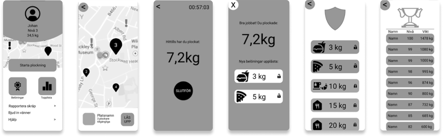
Wireframes served as the blueprint, outlining the basic structure and layout of the app's interface, devoid of detailed design elements. These wireframes provided a clear visual representation of the user journey, interactions, and key functionalities, allowing us to ensure that the app's architecture aligned with user needs and goals. Subsequently, we transitioned from wireframes to lo-fi prototypes, which brought the conceptual framework to life in a more interactive form.
After the creation of wireframes and lo-fi prototypes, we conducted user observation testing sessions to gather feedback from potential users, using the Think Aloud method. These sessions were instrumental in identifying usability issues and guiding our iterative design process. Key findings from our prototype testing included:
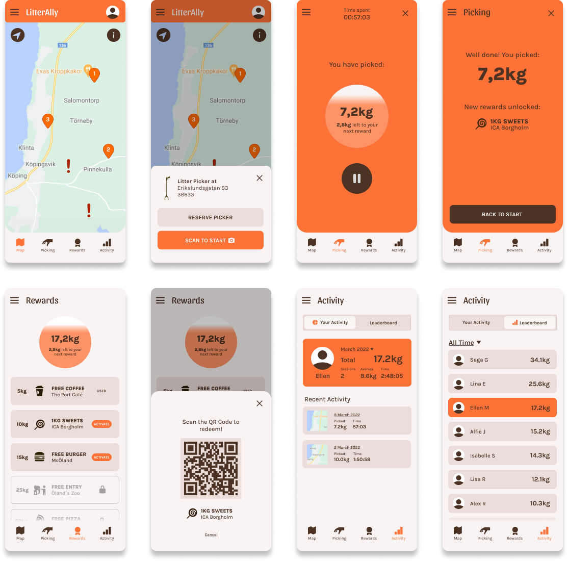
Based on the results of the lo-fi prototype test, we proceeded to make some changes and upgraded the prototype to a more hi-fi version with expanded interaction possibilities and refined visual design. We aimed for a gender-neutral aesthetic, opting for a bright orange color scheme alongside simple fonts and icons. At this stage, we conducted another user evaluation using the same observation and Think Aloud methods as before, as well as a System Usability Scale (SUS) test.
Overall, users responded positively to the second iteration, offering positive feedback such as "nicely updated from the previous version," "easier navigation compared to before," and "seems good; I don't have many concerns at the moment."
However, some participants identified areas for improvement; for example, they suggested making it clearer where the user's position is on the app's map. One user also had difficulty differentiating between the "litter alerts" and station symbols on the map, while another felt that the leaderboard should not be categorized under "Statistics."
We conducted five SUS tests where the results indicated three average scores above 80.3, which falls under the "Excellent" (Grade A) category. Additionally, two users gave us average scores of 72.5 and 80 which corresponds to "Good" (Grade B). These averages reflect our usability performance in terms of efficiency and overall usability, indicating a positive outcome.
Although we acknowledge the potential risk of users attempting to manipulate the system by picking up non-litter items, such as rocks or branches, we recognize that further analysis and mitigation strategies are necessary. Moving forward, we plan to implement safeguards and validation mechanisms to minimize the likelihood of fraudulent activity within the app. This may include leveraging image recognition technology to verify the authenticity of collected items or implementing community moderation features to flag suspicious behavior.
Our solutions don't work for everybody, and there is plenty more that can be done through implementing accessibility features, inclusive language and imagery as well as user testing with diverse audiences. For aspiring designers like us, mastering universal design poses a challenge. As we naturally perceive ourselves as representative users, immersing ourselves in empathetic experiences is vital. This fosters understanding of inclusivity, accessibility, gender equality, and diversity issues.